The logos people remember can usually be drawn from memory in a few strokes. That isn’t luck. Behind almost every durable mark sits a small set of geometric decisions — and behind every one of ours sits a compass, a grid, and a lot of measuring.
This is how we use geometry at Radius: what it’s good for, where its myths are, and where we let the eye overrule the maths.
01 — A point and a radius
Every circle is defined by two things: a centre and a distance. It’s the simplest constructible shape there is, and it’s where our own identity starts. The Radius mark is a circle with one quadrant notched out — a literal radius — locked to a 45° diagonal below it.
Fig. 1 — The Radius mark under construction: grid, radii, circle, notch, diagonals, base.
Starting from a constructible shape matters because it makes a mark reproducible. Anyone with the construction can redraw it exactly — at 16 pixels or 16 metres — without guessing at curves.
02 — One module for everything
Once the circle exists, its radius becomes the unit everything else is measured in. We call it R. In our logo file R is 131.1 units, and every other part of the mark is a clean multiple of it:
Fig. 2 — The Radius mark, measured in R.
| Element | Size |
|---|---|
| Circle radius | 1 R |
| Notch (missing quadrant) | 1 R × 1 R, corner on the centre |
| Base bar | 1 R high × 1.83 R wide |
| Whole mark | ≈ 3 R × 3 R |
| Corner rounding | ≈ 1⁄18 R |
| Gap between mark and wordmark | ≈ 0.69 R |
The same module then runs through the identity: logo clear space is 0.69 R, corner rounding is 1⁄18 of a shape’s short side, and image crops favour 1 : 1 and 1 : 1.83 — the base bar’s own proportion. One number keeps a hundred decisions consistent.
03 — The golden ratio, honestly
The golden ratio, φ, is (1 + √5) ÷ 2 ≈ 1.618. A rectangle in that proportion has a neat property: cut a square off it and what remains is another golden rectangle. Repeat forever and the quarter-circles through each square trace the golden spiral. The Fibonacci sequence — 1, 1, 2, 3, 5, 8, 13, 21… — approaches the same ratio as it grows.
Fig. 3 — A golden rectangle subdivided into squares, and the spiral they produce.
φ is a useful tool, not a magic formula. Plenty of “this famous logo is secretly golden” diagrams are drawn after the fact, with circles chosen to fit.
We reach for φ when two proportions need a reason to relate — a type scale, the split of a layout, the step between sizes of a curve. When the eye prefers something else, the eye wins. A ratio you can’t see isn’t doing any work.
04 — Sacred geometry
“Sacred geometry” is the name given to a family of figures that appear across centuries of architecture, ornament and religious art. Most of them come from one operation: drawing equal circles through each other’s centres.
Two such circles make the vesica piscis — a lens whose height is √3 times the radius. Keep adding circles around a centre and you get the six-petalled seed of life, the start of an endless hexagonal lattice.
Fig. 4 — Vesica piscis, then the seed of life: one radius, repeated.
Why it still matters for logos: shapes built from equal radii share curvature, so they feel related even when they’re far apart. Our secondary glyph — the six-spoke asterisk — sits on exactly this six-fold grid.
Fig. 5 — The Radius asterisk on a hexagonal circle grid. Six spokes, 60° apart.
05 — Angles that move
Circles give a mark calm; a diagonal gives it direction. Our mark’s 45° line falls from top-left to bottom-right, and we use that exact angle everywhere something needs to move: the wipe between pages on this site, the transitions in our launch film, the diagonal hover on our buttons.
Choosing one angle — and refusing all the others — is what makes motion feel like it belongs to the brand rather than to a template.
06 — When the eye overrules the maths
Perfect geometry often looks wrong. A circle and a square of exactly the same height don’t look the same height: the circle touches the lines only at single points, so it reads smaller. Type designers solve this with overshoot — round letters like O and S are drawn a few percent taller than flat ones like H.
Fig. 6 — Same height on paper, different height to the eye. A small overshoot fixes it.
The same family of corrections shows up in every mark we finish:
- Horizontal strokes are drawn slightly thinner than vertical ones so they look equal.
- Points and sharp corners extend past the guide lines so they don’t look clipped.
- Shapes are centred by visual weight, not by their bounding box.
Construction gets a mark to 95%. Optical correction is the last 5% — and the part people feel without noticing.
07 — In our work
When an identity is geometric, we present it with its construction, because the construction is part of the deliverable — it’s how a client’s team keeps the mark consistent after we hand it over. (Not every brand should be geometric: RAWR’s identity is deliberately hand-drawn, because that brand is about rough ideas.)
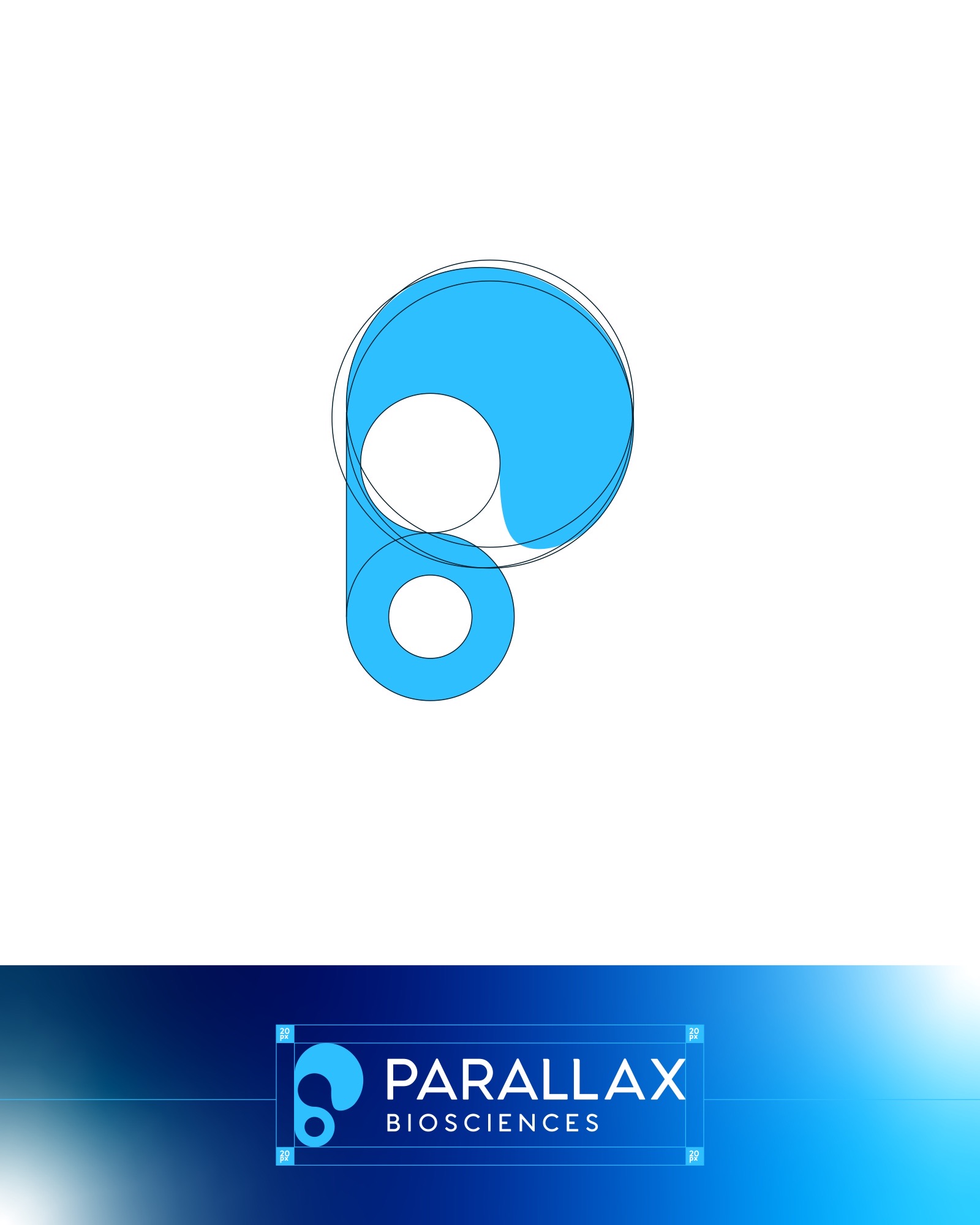
Fig. 7 — Parallax Biosciences: a fluid mark resolved from circles. See the case study ↗
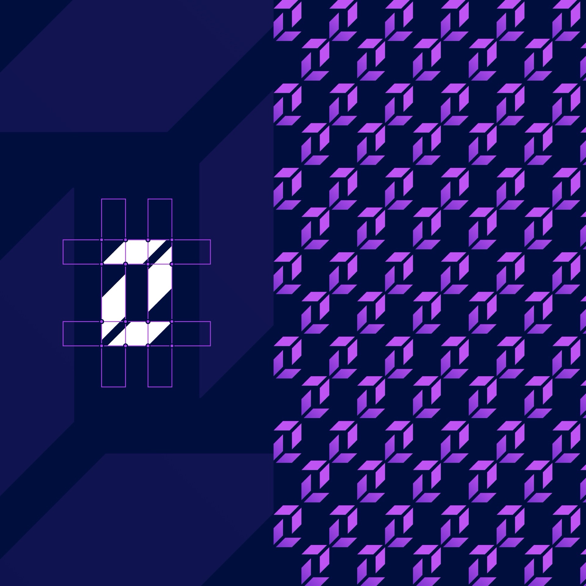
Fig. 8 — DualSync: the monogram on its construction grid, and the pattern it generates. See the case study ↗
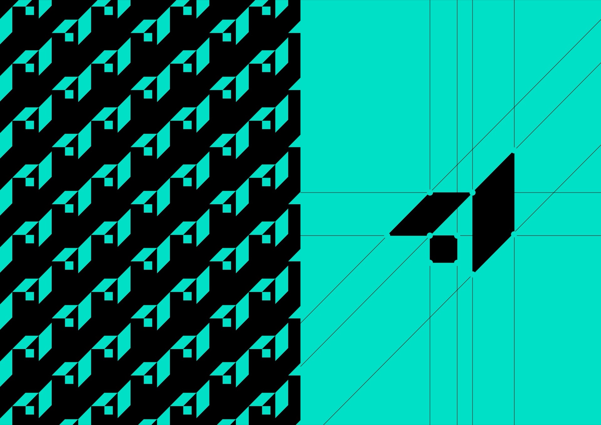
Fig. 9 — Aether: the monogram as a repeating pattern, and on its construction lines. See the case study ↗
08 — Five rules we draw by
- Start constructible. If you can’t describe how a shape is drawn, you can’t keep it consistent.
- Pick one module. Measure everything in it, from the logo to the layout.
- Limit the angles. One or two directions, used everywhere, read as intent.
- Use ratios for reasons. φ, √2, 1 : 1 — only when the relationship is visible.
- Let the eye finish it. Correct optically, then check it small, large, and in one colour.
Geometry won’t make an idea good. But it makes a good idea clear, reproducible and hard to forget — which is the job a logo has to do for decades.